


Overview:
Happy Feet is a specialist club focused on trekking and adventure activities. They organize trips to unique and hidden gem destinations, offering participants a chance to explore challenging terrain, engage in adventure activities, foster respect among participants, and find psychological balance while immersed in nature. Additionally, Happy Feet serves as a platform to learn travel ethics and create friendships, while also contributing to the development and connectivity of rural areas in Morocco.
Keywords:
Happy Solidarity Adventurous Respectful Sustainable Friendly
Problem:
The logo is too complicated and generic, making it hard to be remembered, lacks versatility, and fails to stand out.

The wordmark “Happy Feet” is written in a style that’s bold, organic and with soft edges
That combines approachability, a natural or eco-friendly vibe, and adventurous characteristics.
That combines approachability, a natural or eco-friendly vibe, and adventurous characteristics.

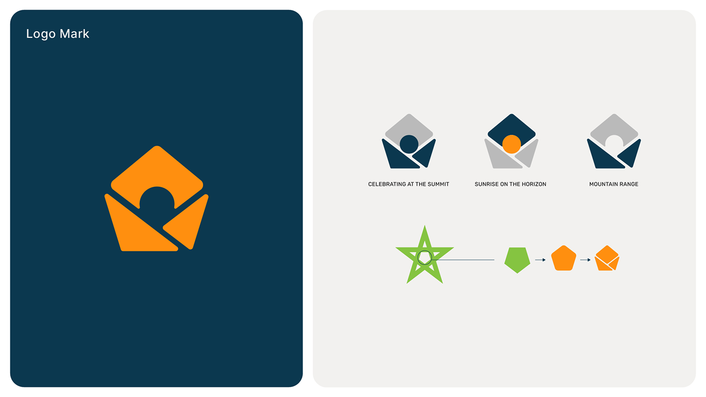
The symbol consists of three pieces combined together to form a pentagon, with rounded edges to maintain consistency with the wordmark conveying its friendly personality.
The concept of combining three pieces to create a single shape (pentagon) conveys the brand's values of solidarity and community.
The pentagon design is inspired by the central element of the star (pentagram) on the Moroccan flag.


